The Image Feature element allows you to add an image with a headline and text element. Utilise this option when adding team member highlights or product/service highlights to your funnel and website pages. On the left-hand side of the page, you will see various customisation options for your Image Feature that we will review here.
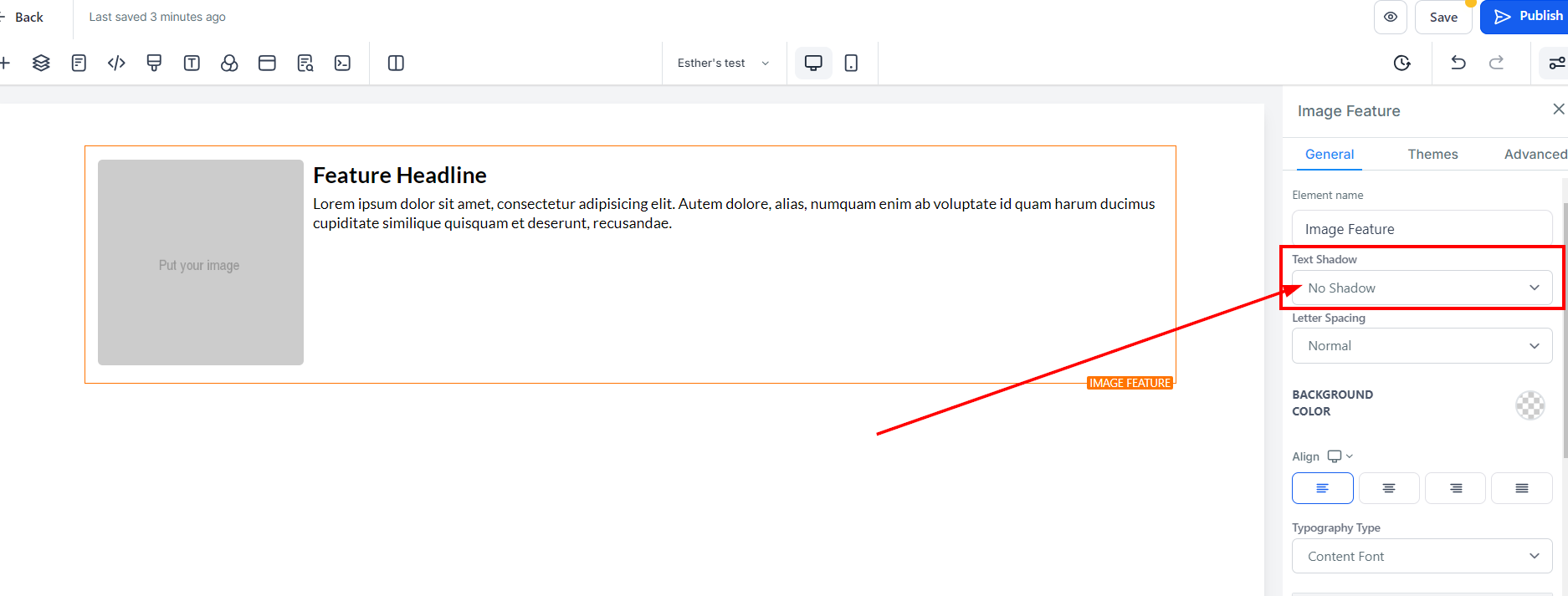
In the General Settings tab, you will first see the Element Name/Title. The default name will be listed as the element name. You can choose to leave it at the default value or rename it for easier identification as you build out your page.
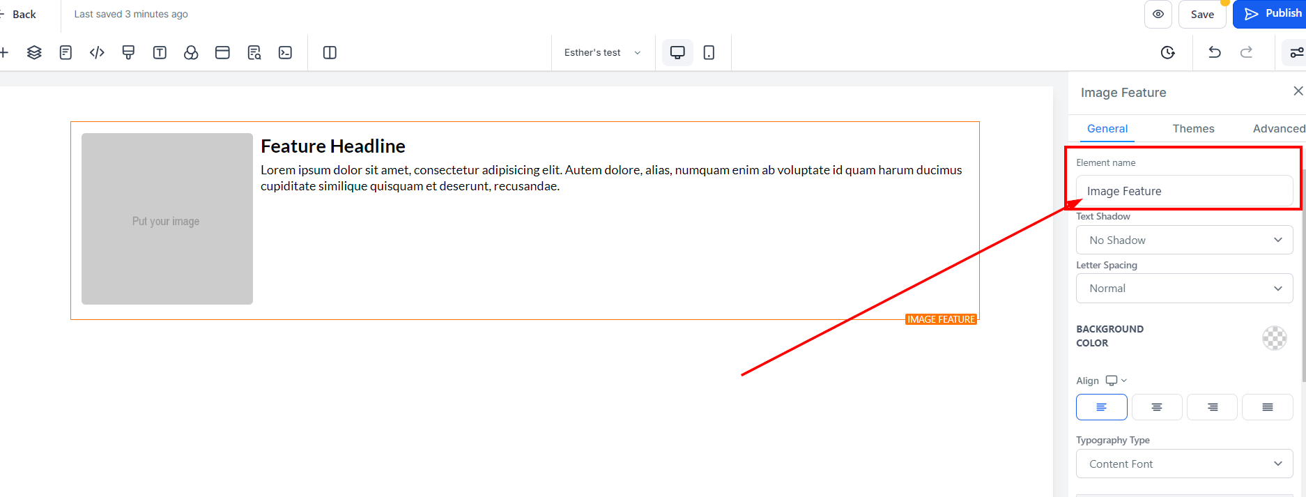
The Text Shadow option will allow you to add a shadow to your text. Here your options are light fade, mid-shadow, and strong shadow.
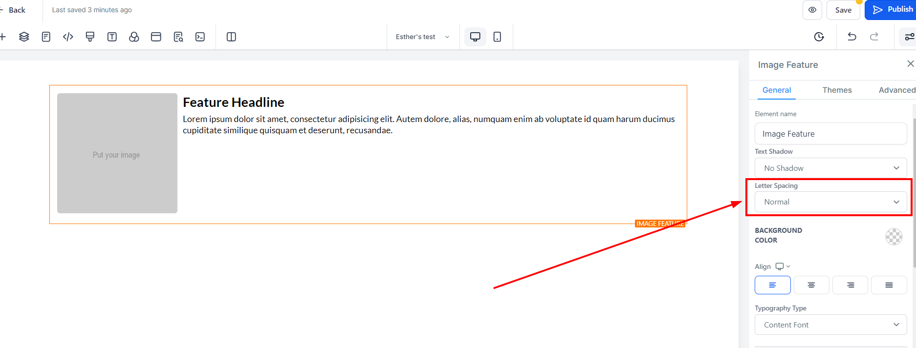
The letter spacing option gives you the ability to space out the letters in your text or use a negative value to push the letters closer together.
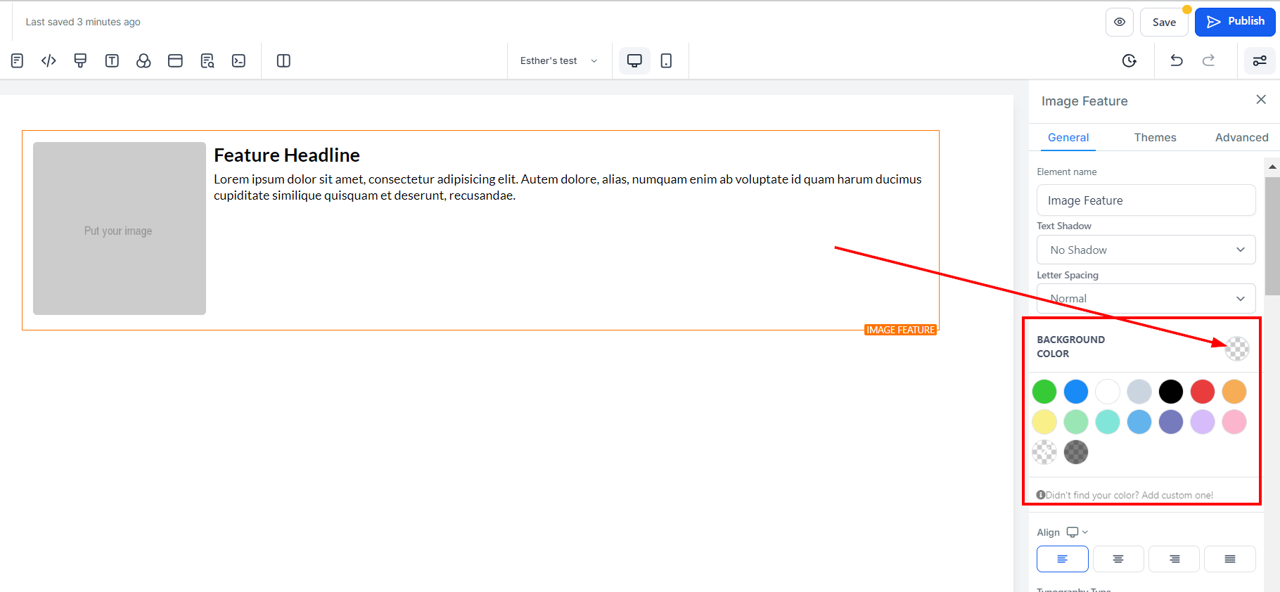
To modify the background colour of your Image feature, select the content you wish to adjust and click on it.
From the options given, you can select a colour or input a custom colour code if you didn't find the exact shade you were looking for. Simply type in the code in the designated space and click Add colour.
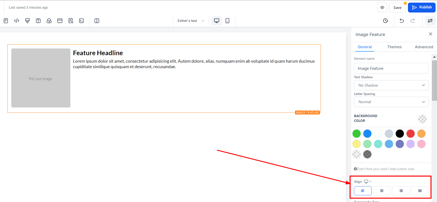
You can align the text in your image feature box with the Align option, which allows you to position your text to the left, right, center, or as justified.
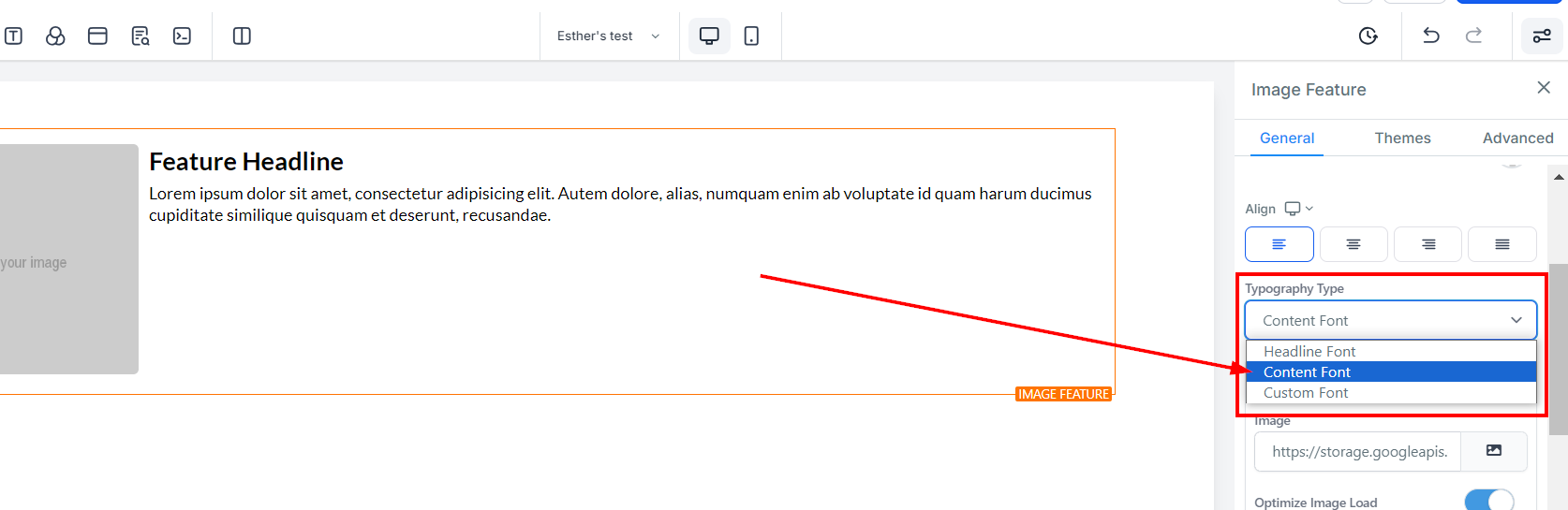
The typography type gives you three options for your font type, including the headline or content font you set-up in settings, or choosing a custom font and selecting a font from the dropdown menu.
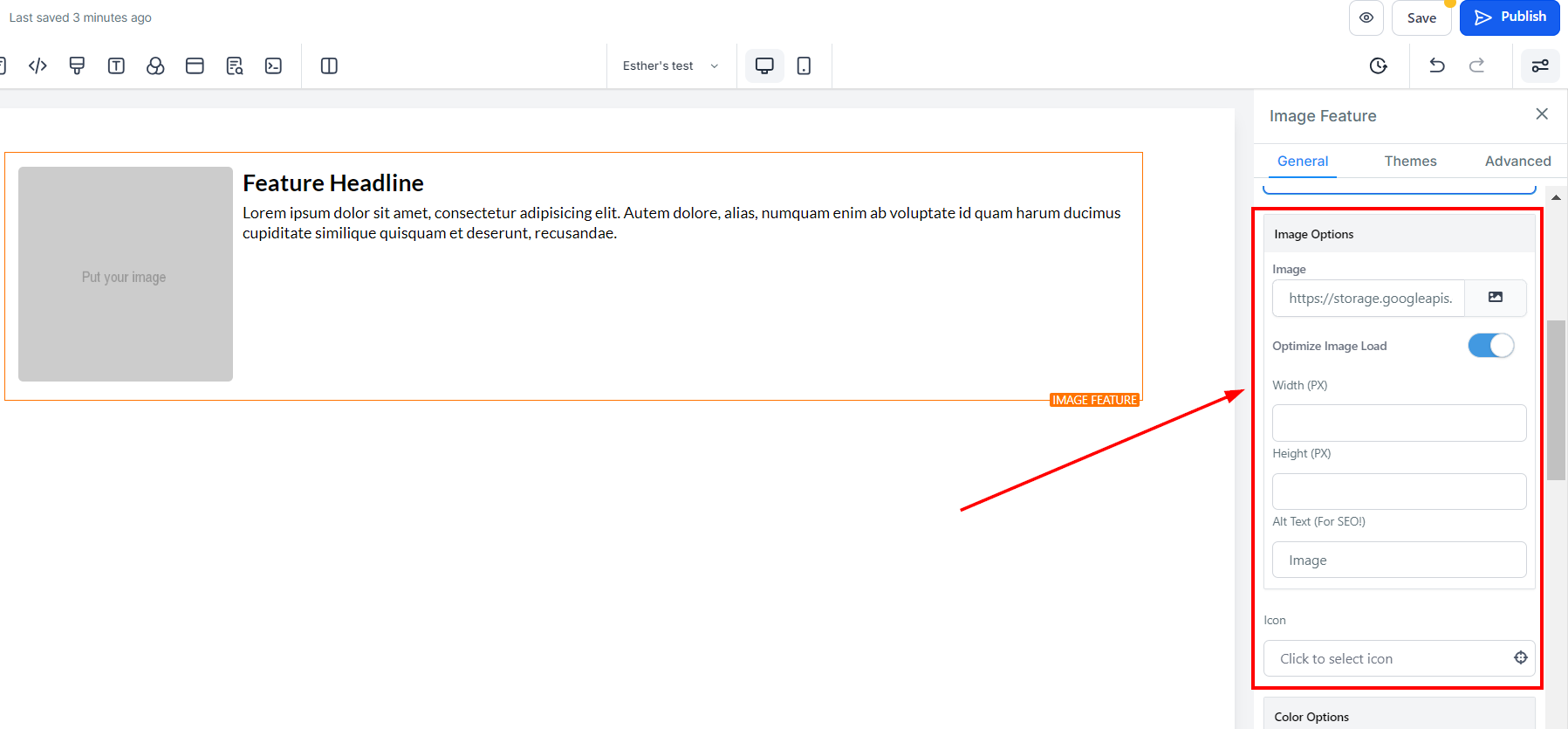
When you click on the image icon on the right side of the space provided, it directs you to the storage page where you can upload the image you want to use. Once you've uploaded the image, click on the image, and then click on the "copy to clipboard" icon on the right upper corner of the page, beside the "delete" icon to copy the image URL. Click on the "Back" button to return to the Editors' page, then paste the URL in the space provided your image will appear on the editor's space.
To optimise image load, simply toggle it off. It comes with a warning, if you are sure you want to turn it off click "Ok"
Warning: If you turn off image lazy loading, it might affect your page speed. Optimising images for your website can reduce your total page load side by up to 80%. 
You can decide the width and Height here by inputting your desired size in the space provided.
You can add the Alt text here.
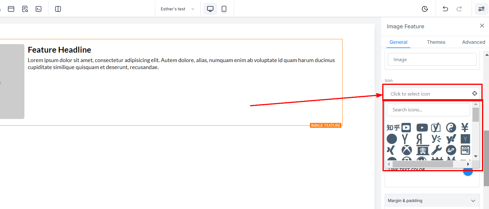
To add an icon to your Image Feature, simply select from the list of available icons. If you have a specific icon in mind, you can type it into the search bar to narrow down the options. This icon will appear next to the image feature headline text.
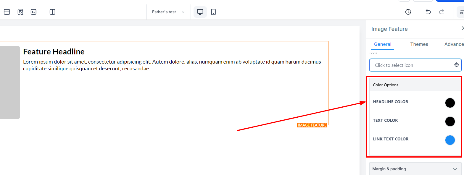
Under Headline Colour, you can adjust only the colour of the headline text for your image feature. For example, the Feature Headline text.
For the colour of the text itself, you can only adjust it under Text Colour when adding text to your image feature.
Additionally, for the colour of link text within your image feature, you can only adjust it under Link Text Colour.
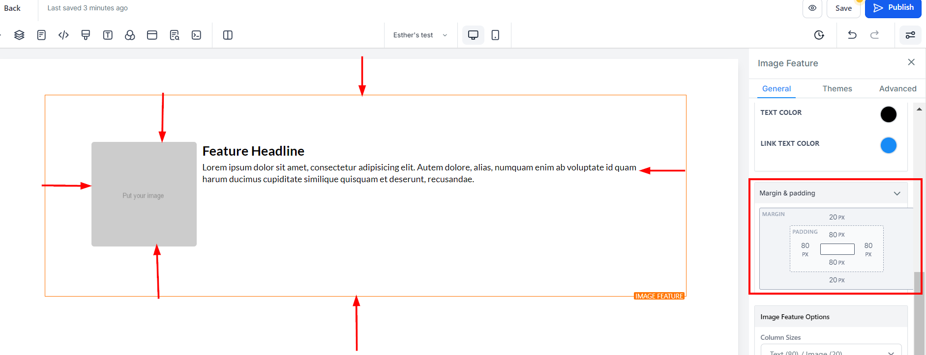
Under Spacing Options, there are several ways to adjust the spacing of your video content.
You can adjust the content's placement by toggling the Padding Left, Padding Right, Padding Top, and Padding Bottom toggle bars. Each toggle bar moves the content either to the left, right, top, or bottom, depending on the bar clicked.
To adjust the top or bottom margin of your content, use the Margin Top or Margin Bottom toggle bars.
This will help you increase the size of the text and image.
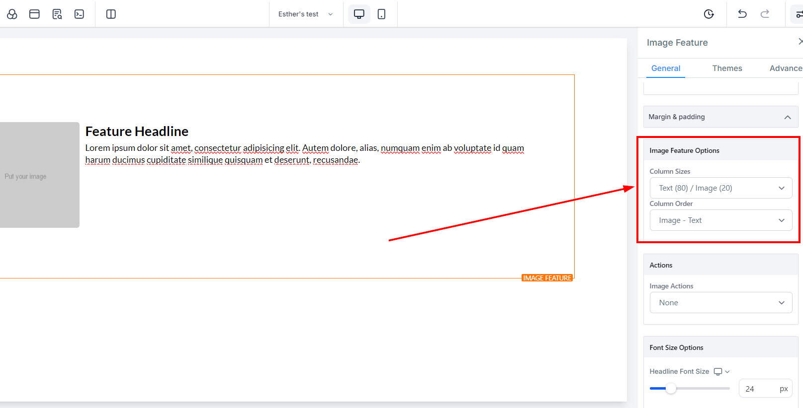
You can decide to arrange your image feature as "text before the image" or "image before the text".
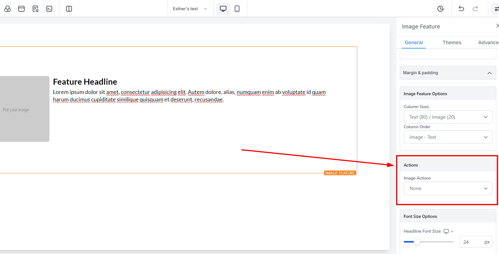
Under Actions, there's the Image Action option that allows you to choose between Open the popup or Go to the website URL.
When you select "Go to website URL" in the "Image Action" icon, it will require you to select which website page you will be setting.
Additionally, you can toggle on Open In New Tab to direct visitors to a new tab when they execute an action.
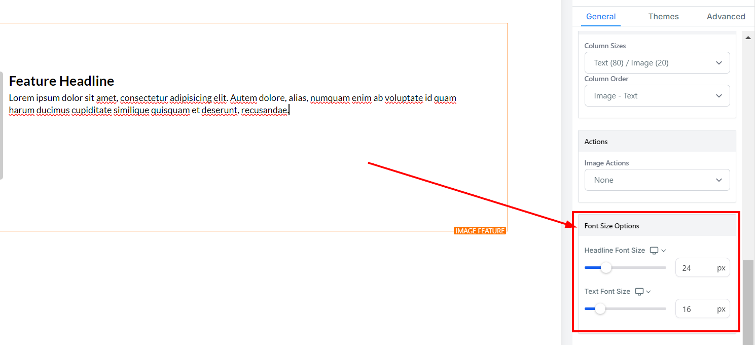
You can adjust the mobile and desktop headline font sizes of your minute timer simply by adjusting the size bars.
You can adjust the mobile and desktop text font sizes of your minute timer simply by adjusting the size bars.
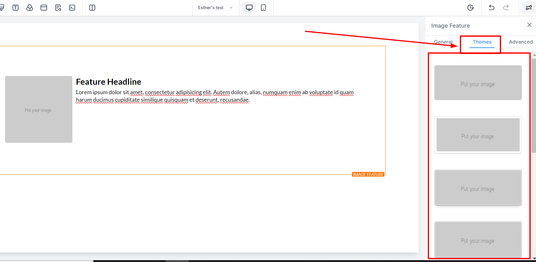
Under the Themes tab, you can select a theme for your image from the options available. Note that when you select a theme, some of the edits you made in the previous step will be removed. If you would like to undo an action, simply click the undo icon in the toolbar at the top of the builder page.
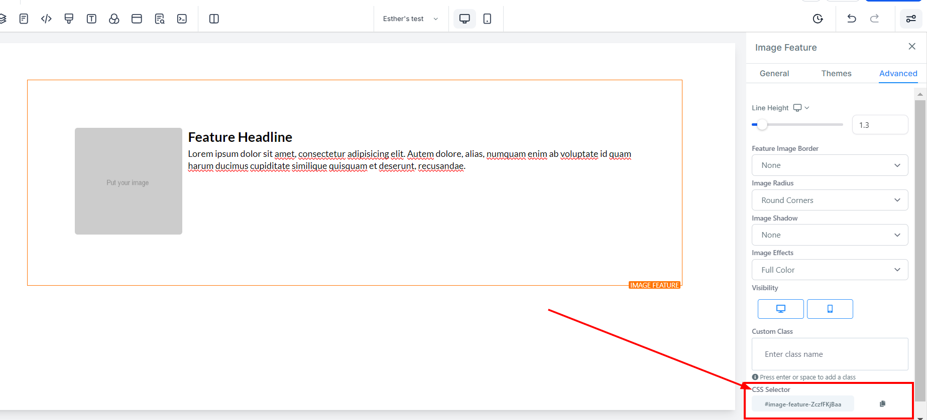
Under Advanced Settings, you have options to make more specific adjustments to your element box.
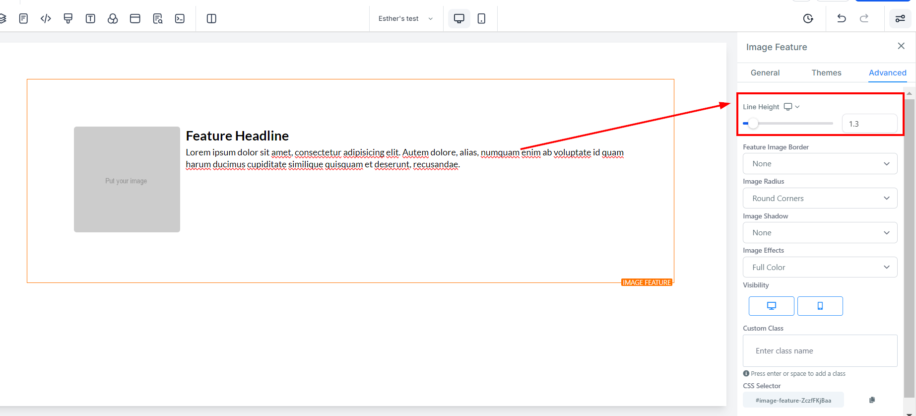
By using the Height Line feature, you can adjust the height of the element box by moving the size bar to the desired height.
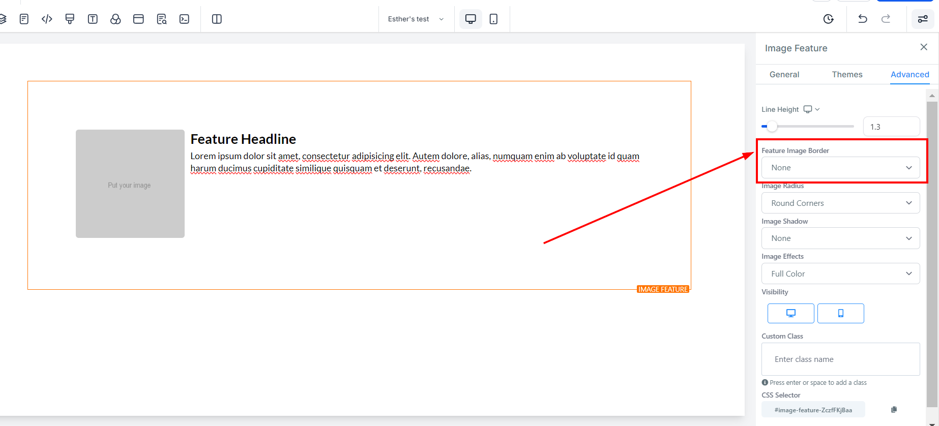
For the Feature Image Border, there are different types of border options available to choose from. Once you select one, a settings menu pops up.
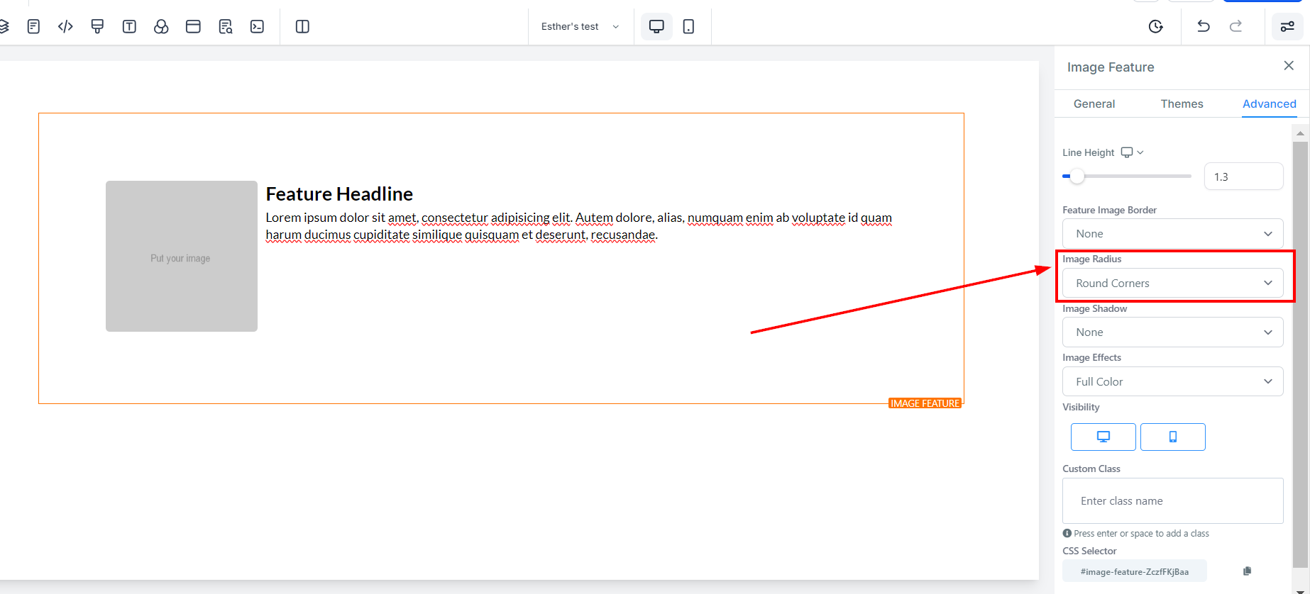
You can also adjust the border's curve by using the Image Radius feature. By increasing the number, the edges become curvier.
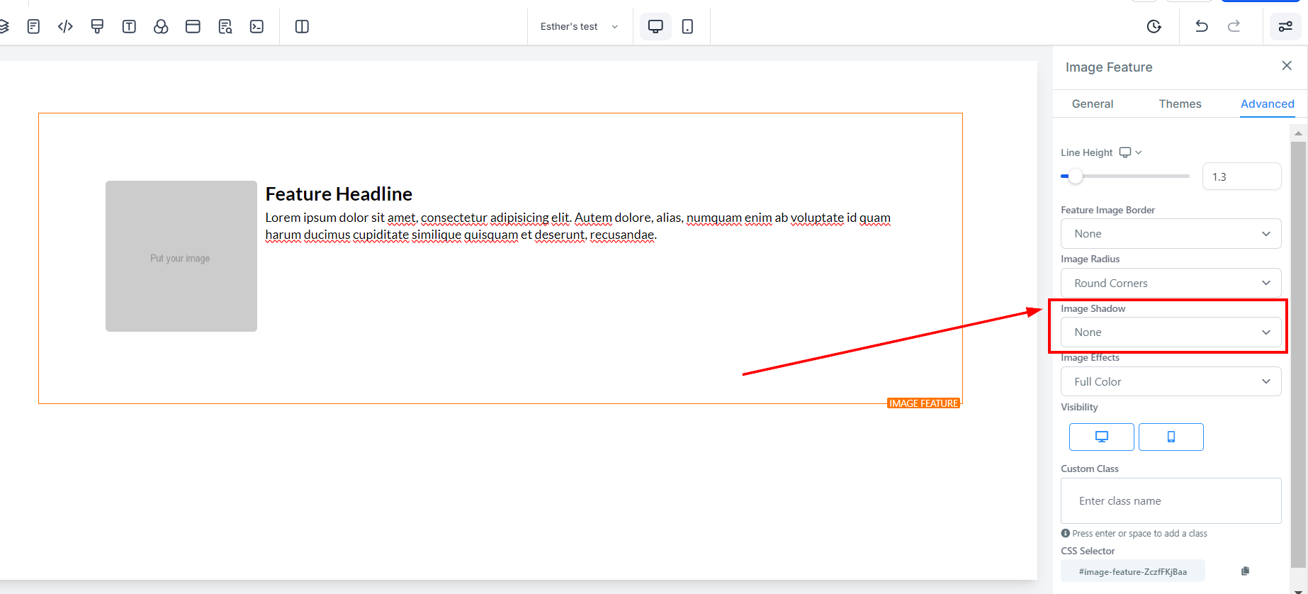
If you want your image to have a shadow, you can adjust its strength using the Image Shadow feature.
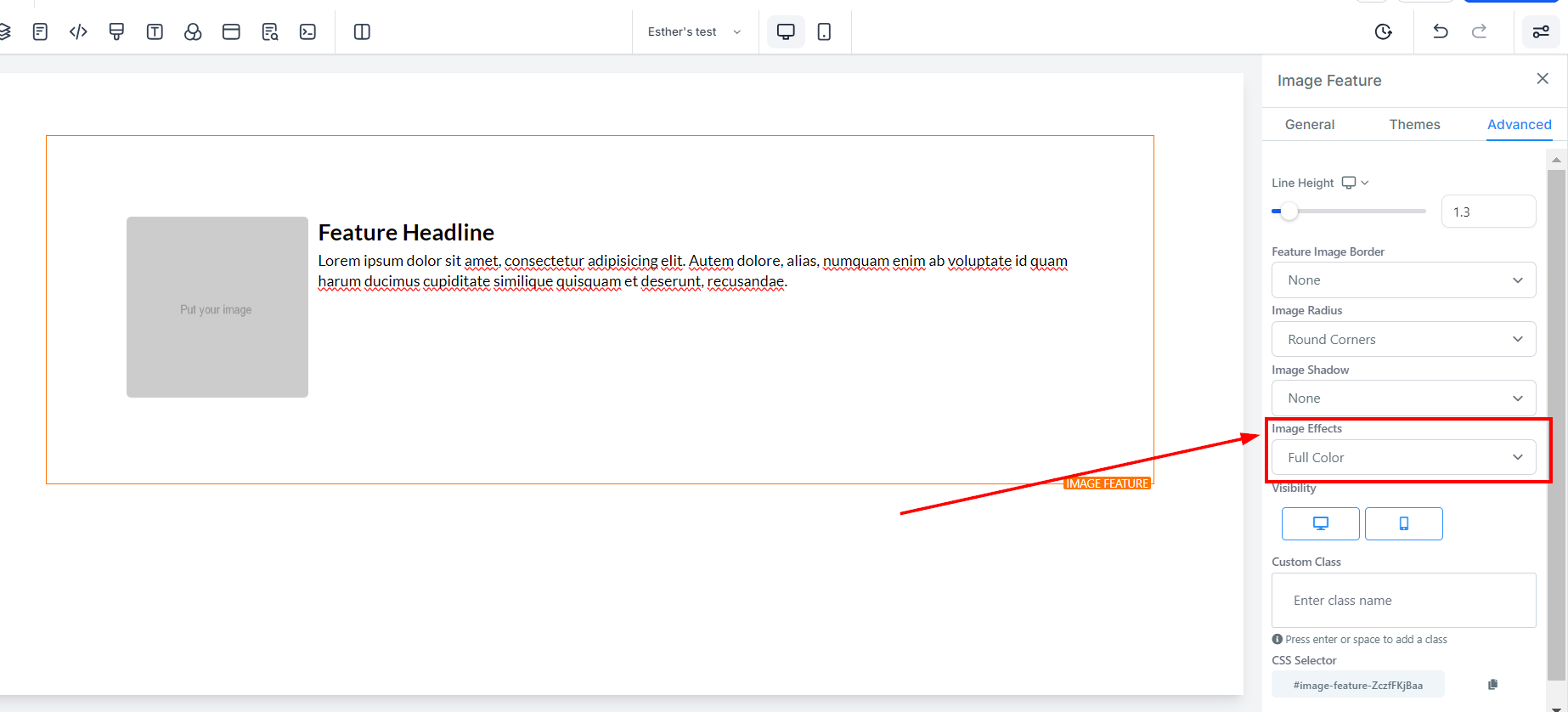
Additionally, you can add an effect to your image by selecting from the available options under Image Effects. You can choose to show the image in Full Color or Black & White.
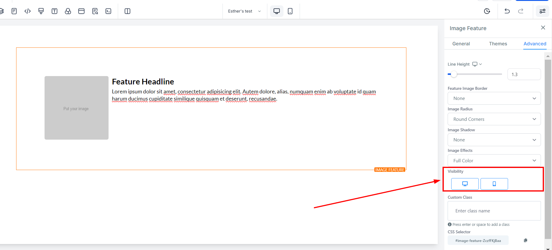
Under Visibility, you can choose whether you want this specific editing option to be visible on mobile devices, desktops, or both. Simply click on the icon to highlight it based on your preference.
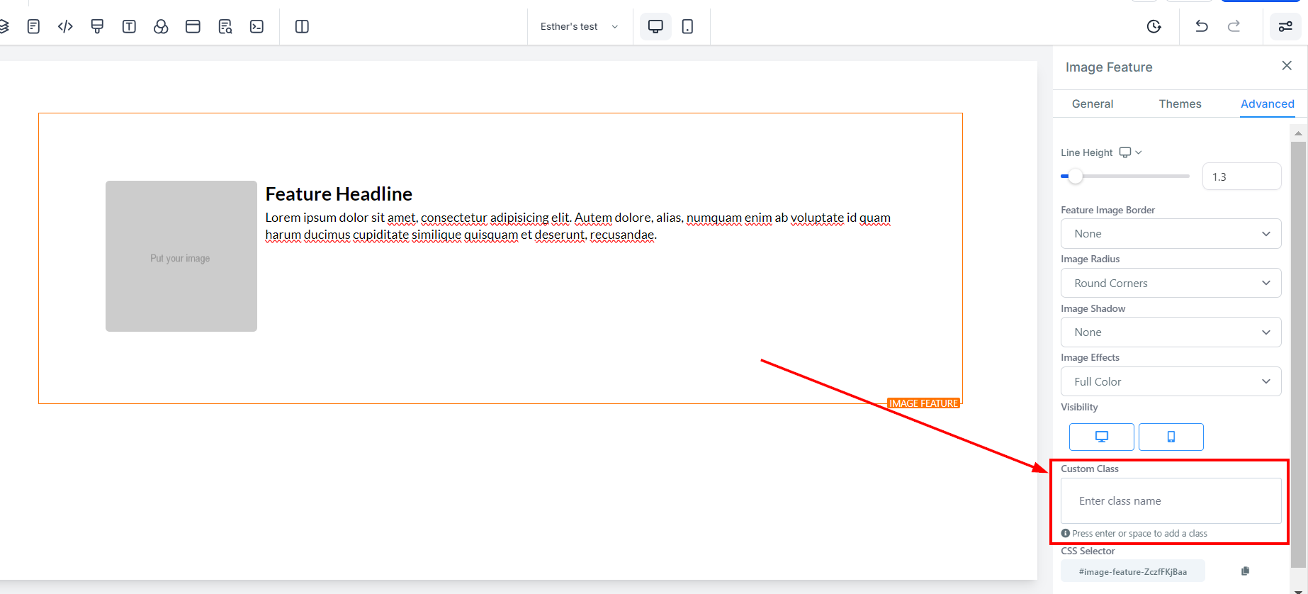
For Custom Class, you can input your preferred class in the space provided.
If you need to copy the Custom CSS, just click on the "Copy" icon on the right side of the reference code.