The Paragraph can be used to type in sentences or the body of a page.
Integrating paragraphs into your webpage is a breeze. All you need to do is select the paragraph element and drag it to the desired location within your editor's workspace. Once placed, tailor the paragraph's appearance and content to match your style preferences and seamlessly blend with the rest of your site's design.
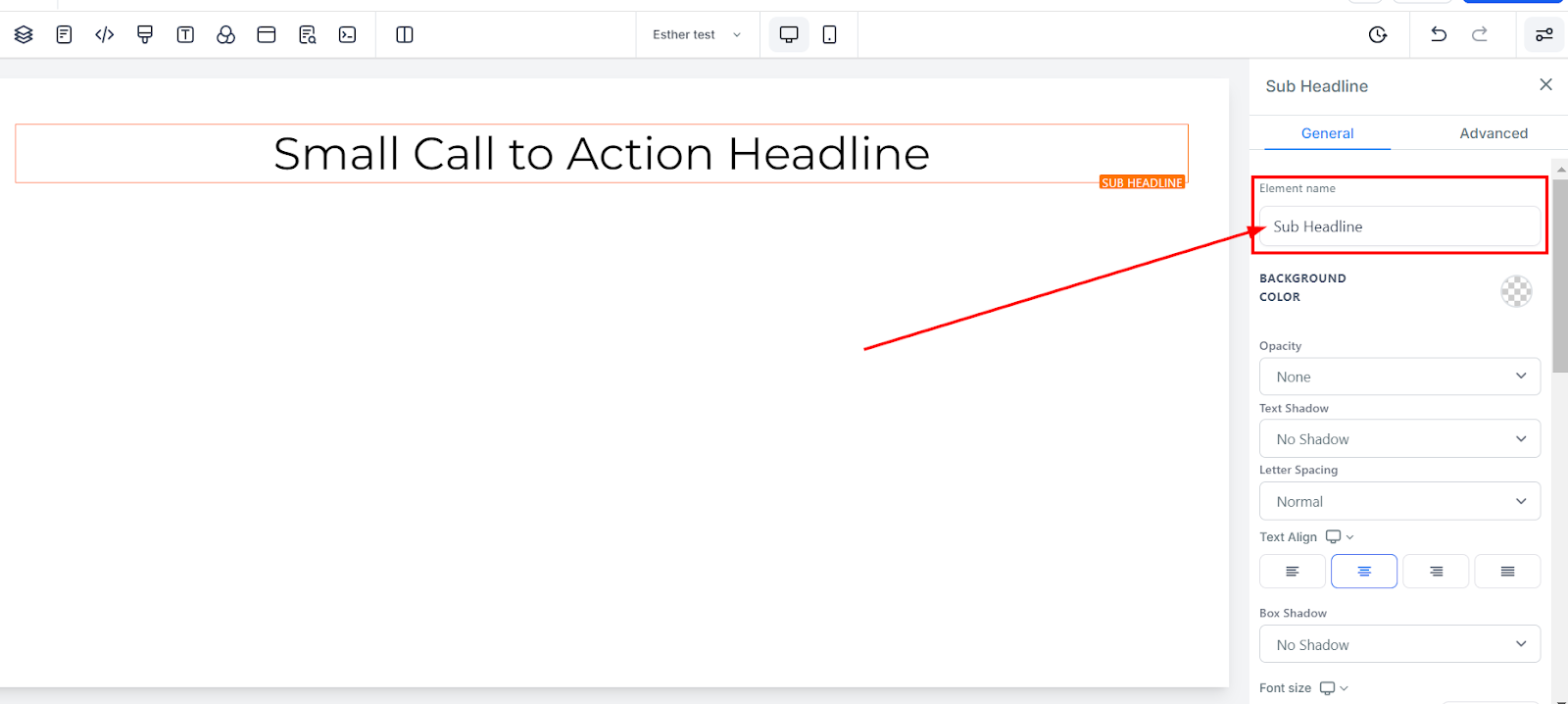
The editing toolbar for the selected element is located on the left side of the editor. You can rename the default name or title displayed at the top of the screen for easier navigation as you create your funnel page.
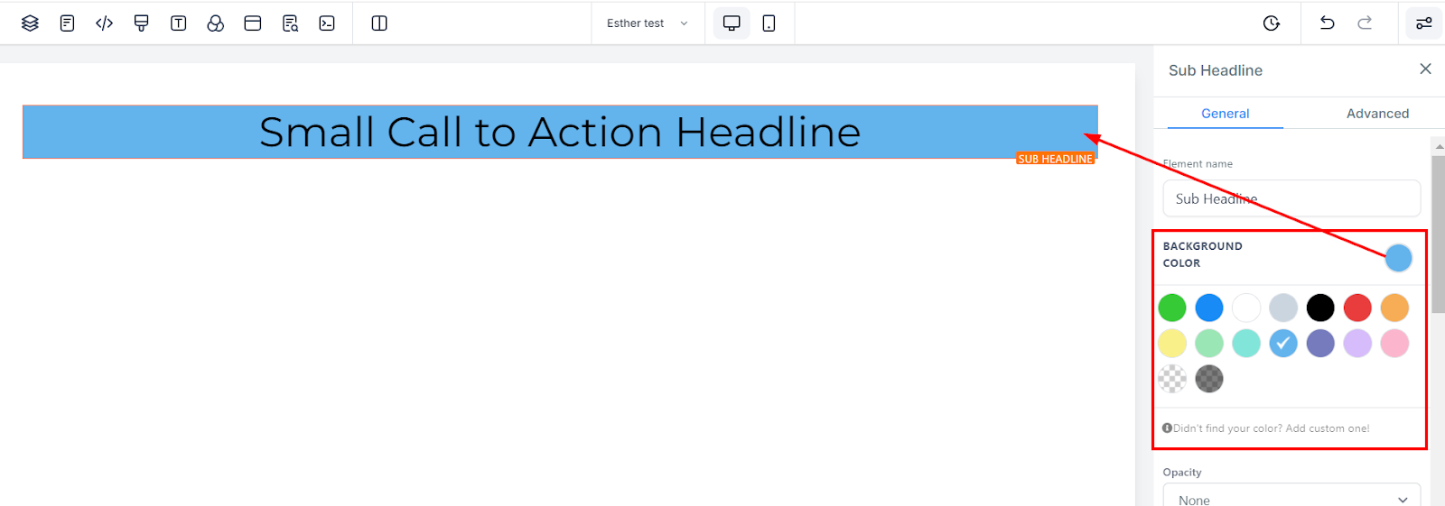
To change the background colour of your paragraph, select the content you want to adjust and choose the desired colour. If you cannot find the colour you prefer, add custom colours by entering the colour code and clicking the "add colour" button.
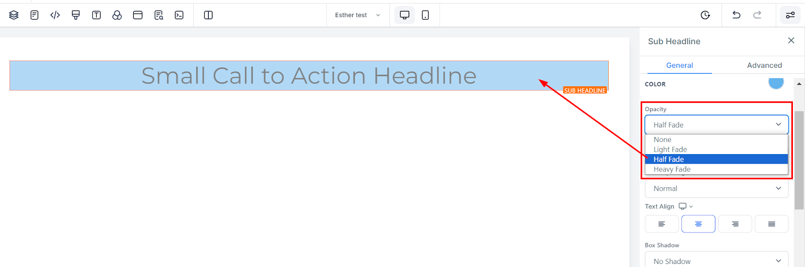
You can decide the extent to which you want your text/content to fade in each element box. The opacity varies from None, Light, Half, to Heavy fade.
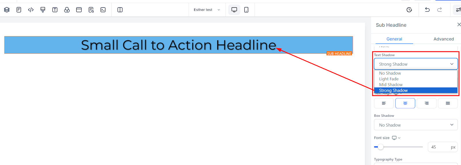
If you want your text/content to have a shadow, simply select how thick or light you want the shadow to be.
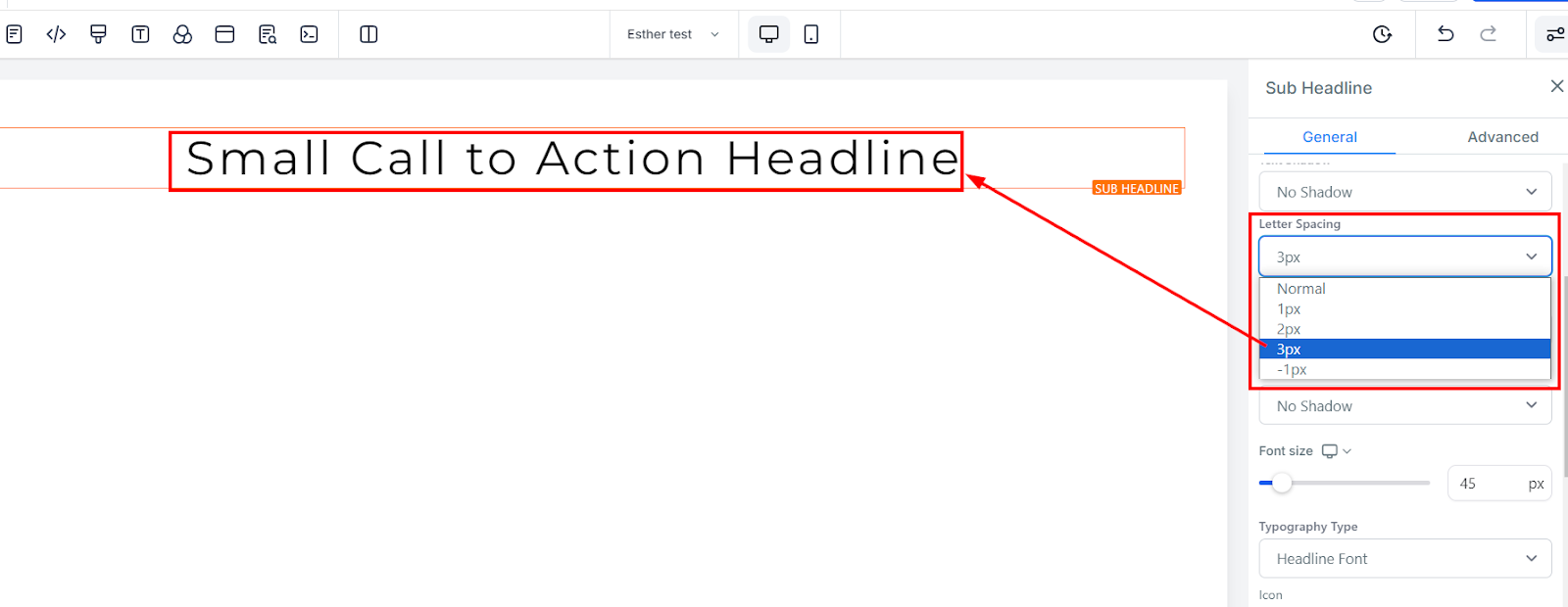
You can decide how wide apart you want your letter to be by clicking on this option.
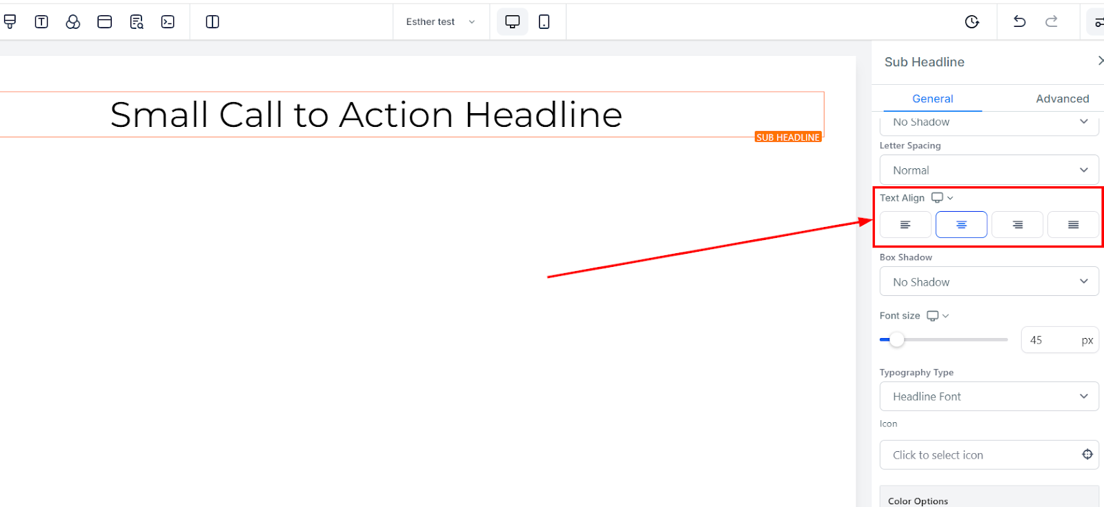
You can move your text in different positions as you deem fit, you can position it to the Left, Center, Right, or as Justified.
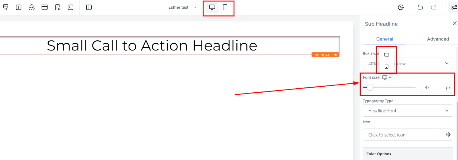
You can modify font size for mobile and desktop devices by using size bars for each text or content element. Toggle between mobile and desktop views in the top left corner of your funnel builder to see how your edits will appear on each platform.
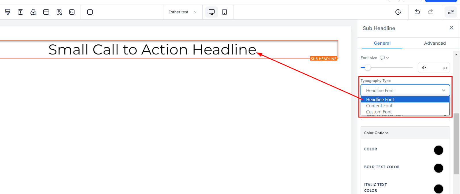
You can select the paragraph or content font previously chosen from the settings or choose a new typography font from the drop-down menu.
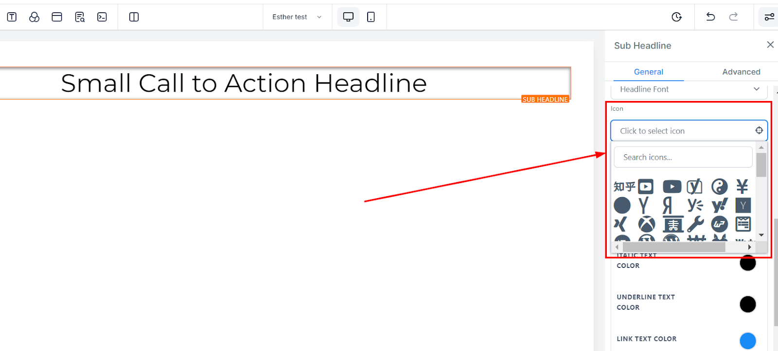
You can add an icon to your page by simply selecting from the available icon. If you have the desired icon in mind, you can type it into the search bar to narrow down the options.
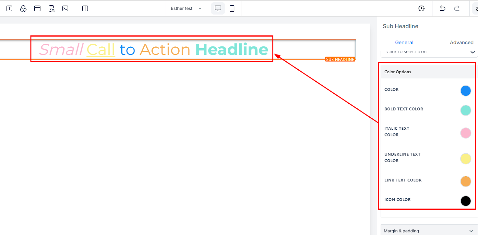
When a text isn't in bold form, you can only adjust its colours here
If a text is in bold form, you can only adjust its colours here.
You can only edit an italic text colour here
You can only edit an underlined text colour here
If you have a link added to this page, you can only edit the link colour here
If you have an icon added to this page, you can only edit the icon colour here. Only the icon colour will change regardless of the position it's placed.
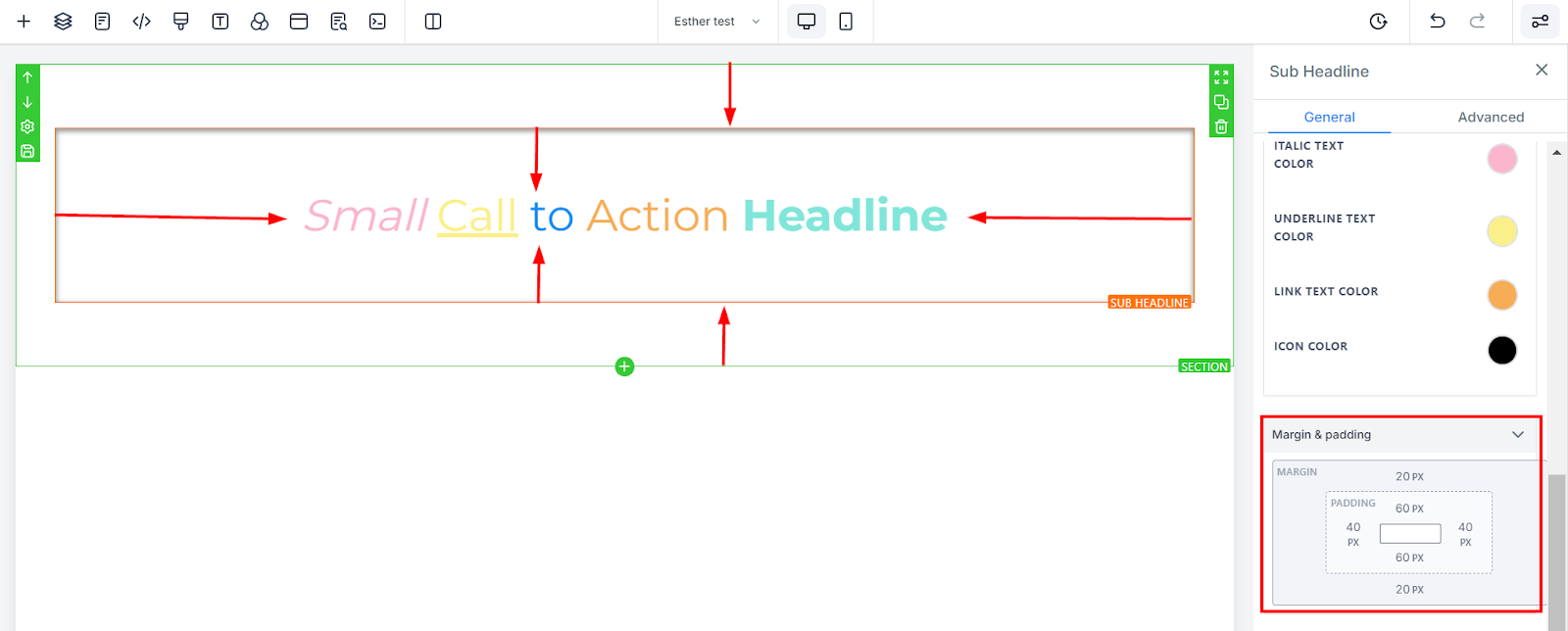
There are different spacing options available for adjusting your content. Depending on the Edit option you are working on, the settings will only apply to that option. For example, if you are editing a particular Row (the BLUE box), only every content in that Row will follow the command of what settings you make.
These four (4) different toggle bars move the content to either the left, right, top, or bottom depending on the toggle bar you click on.
You can adjust the top or bottom margin of your content by toggling its bars.
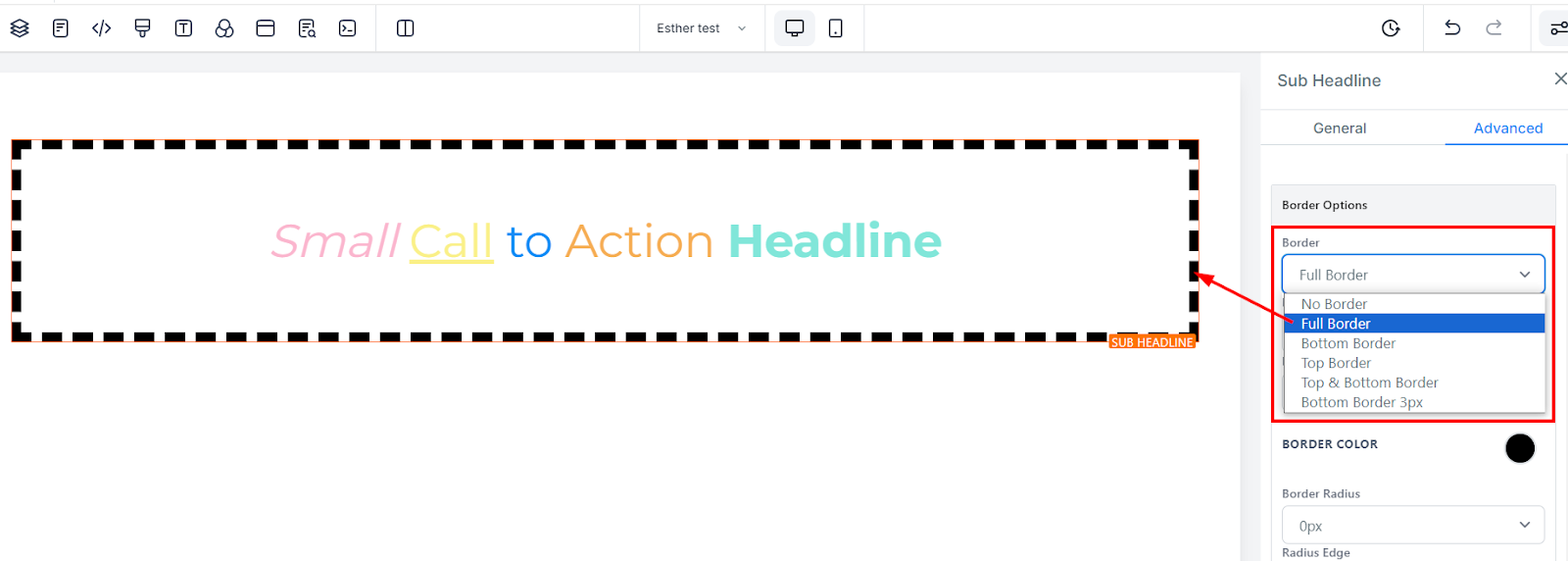
You can choose the type of border you want. Once you select any of the border types, the settings for the border pop up.
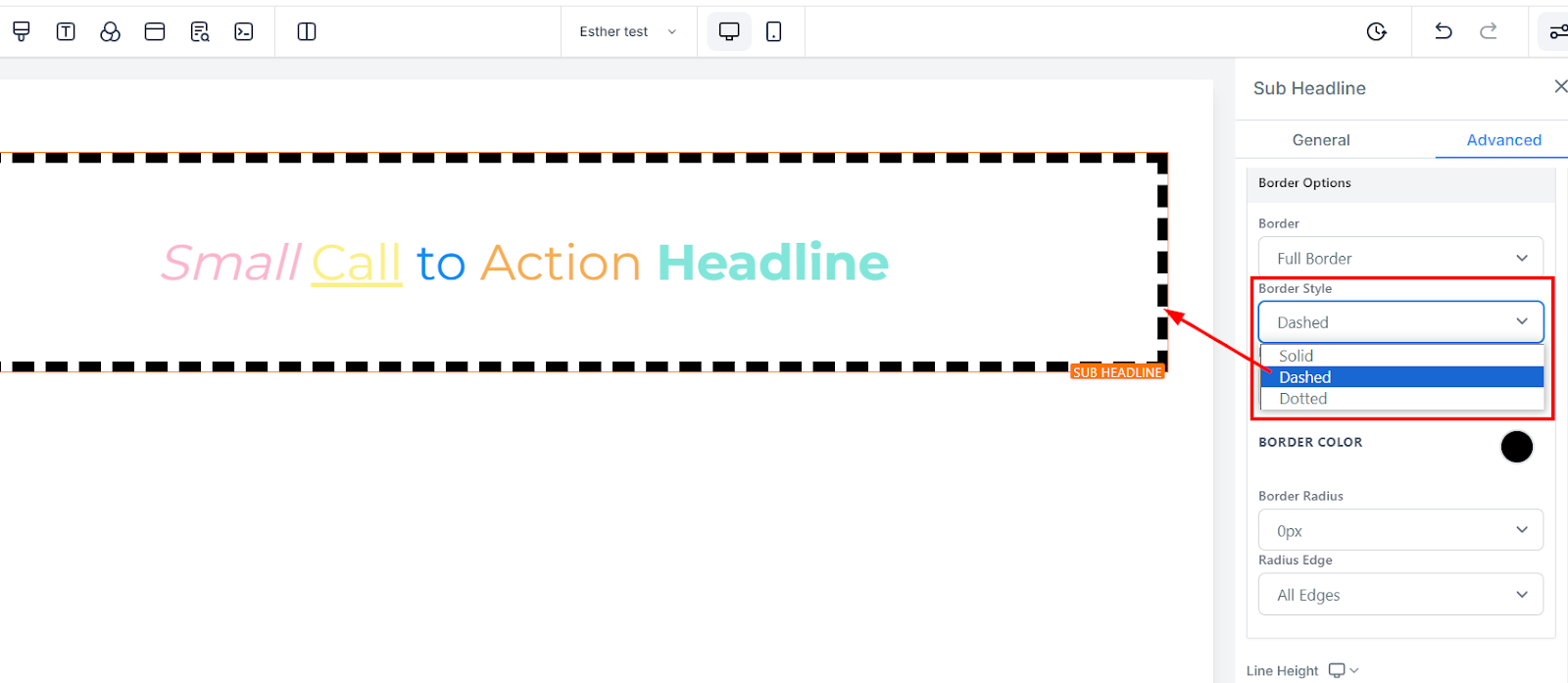
There are three (3) Different styles for your border, It could be a solid, Dashed, or Dotted border.
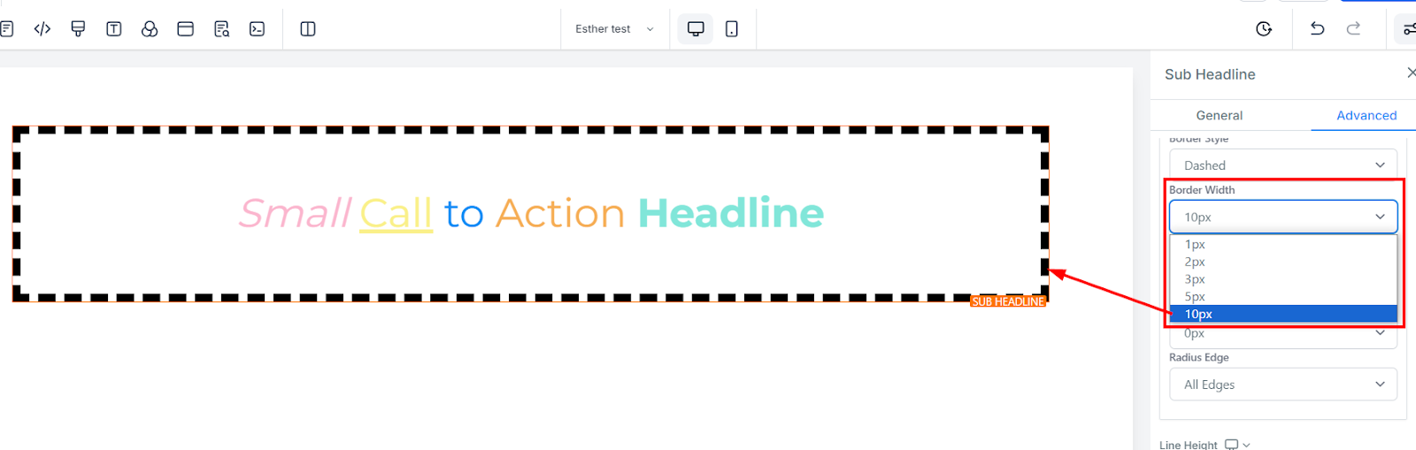
When you increase the border width, it increases the thickness of the border.
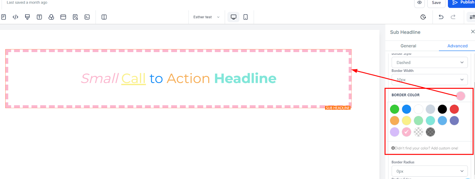
To change the colour of the border, click on this colour icon.
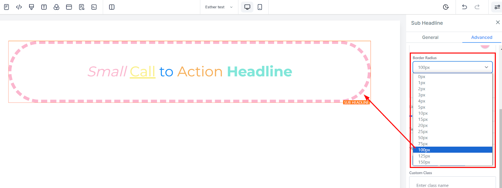
Adjusting the radius of your border curves the edges of the border, the higher the number you select, the curvier it becomes.
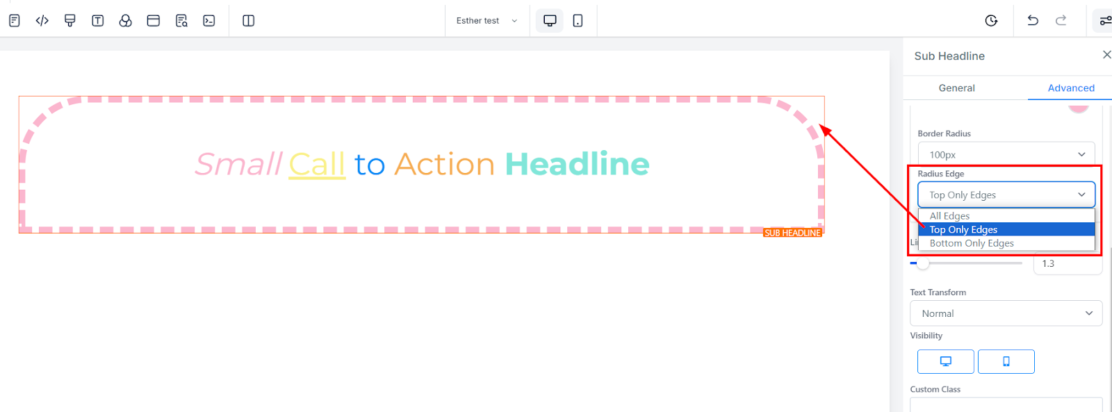
You can decide the corner of the border you want to curve, either all edges, Top only, or bottom edge only.
You increase the height of the Element box by adjusting the size bar.
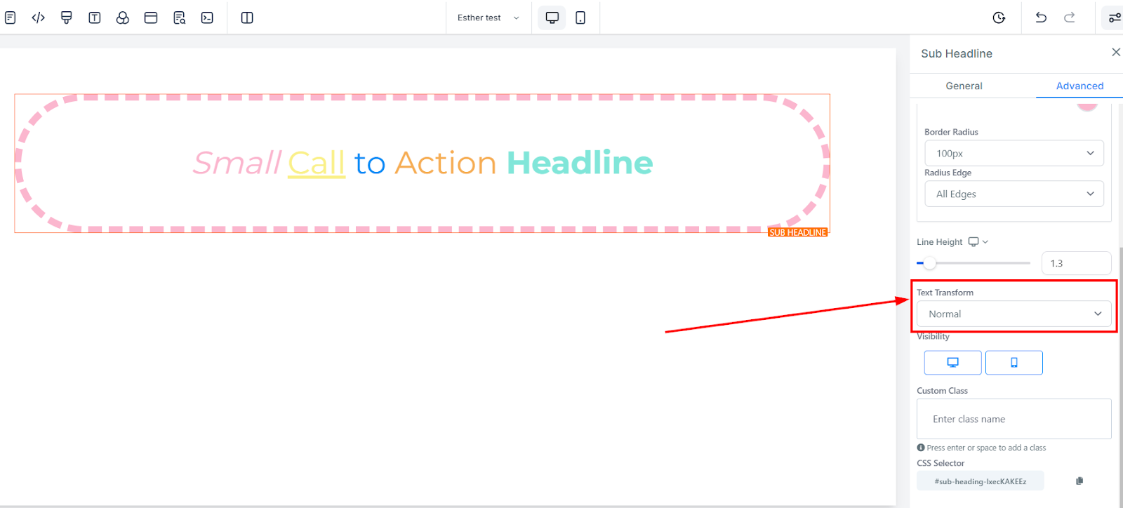
In the Text Transform, you can decide to change the text to Uppercase, Lowercase, or just capitalize each word.
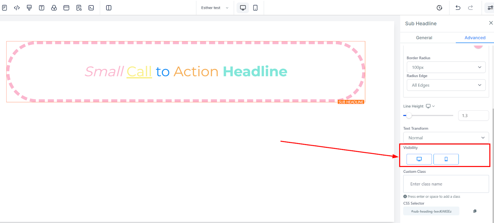
You can make this page visible on both desktop and mobile, and you can also select just one of the two by simply clicking on the one you want to activate.
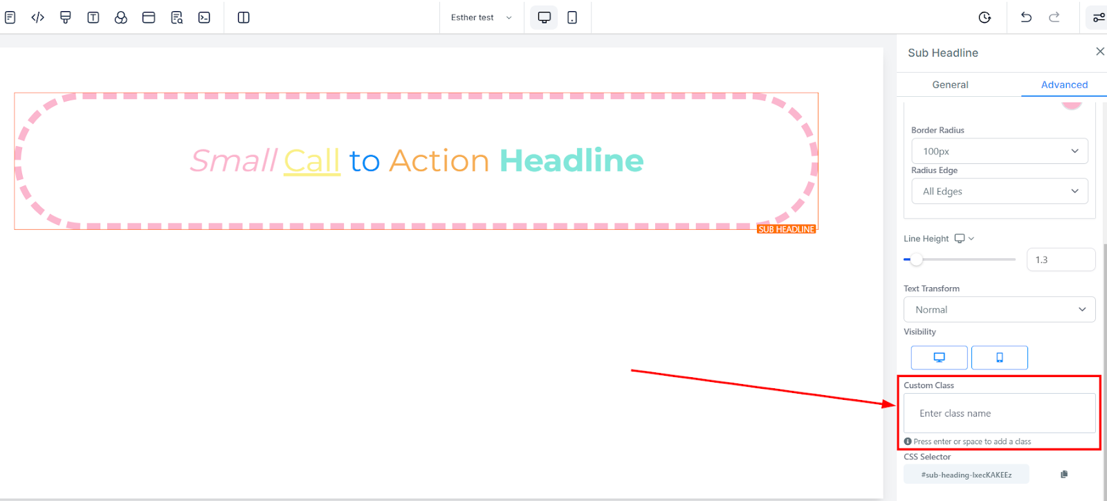
To add a Custom Class, simply fill in the Custom Class field with your desired class name.
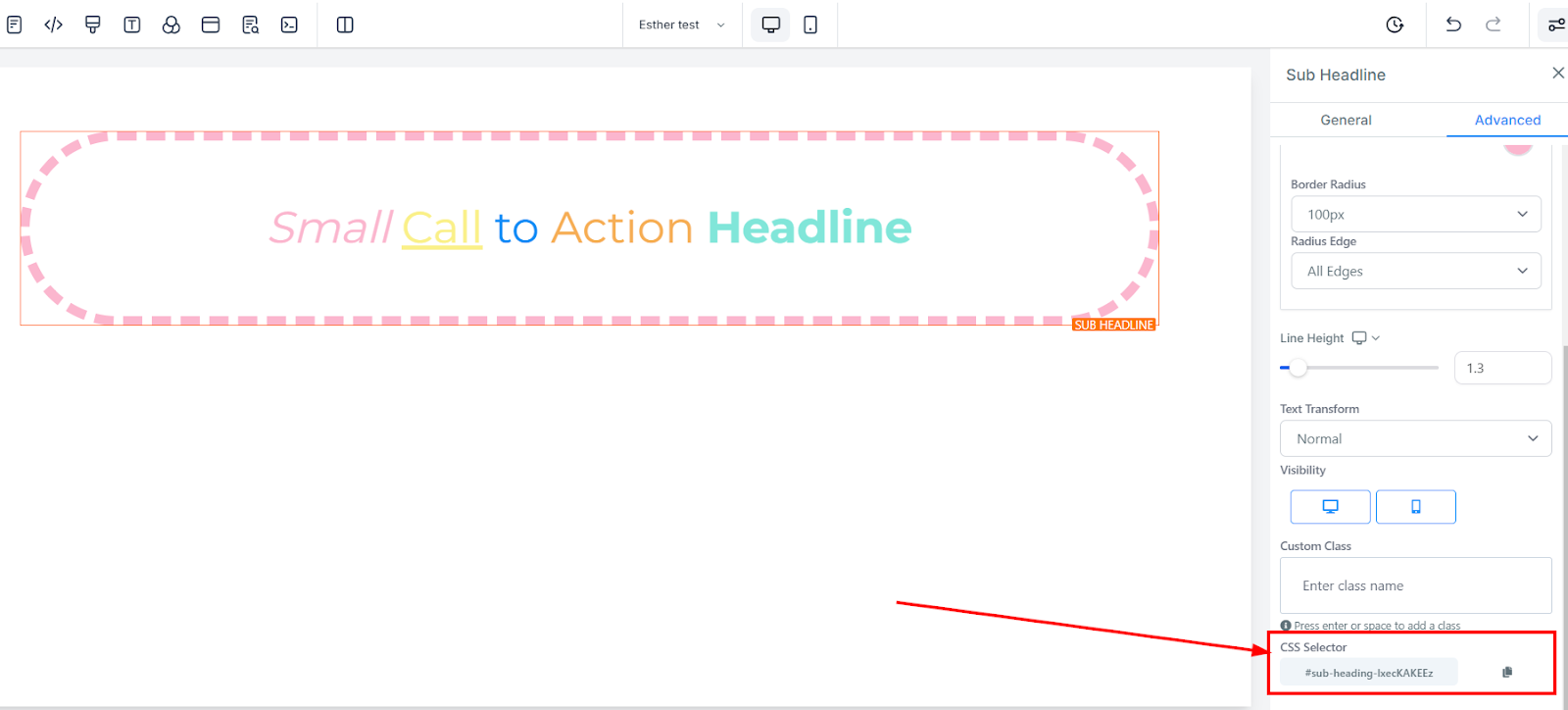
Click on the copy icon located on the right side of the reference number you wish to copy to copy the CSS Selector.